Goodreads UI Language Style Guide
Written & compiled by Sam Julian, Amy Bickerton, & Brooke Ginnard
Introduction
Goodreads members appreciate intentional language. It’s part of why they are readers. This style guide exists to help you communicate with our readers in a consistent manner across the Goodreads brand, and to build considerate experiences across all content in our product.
Tenets
● Consistent - We employ consistent language and UI conventions. Consistent, predictable UI helps members explore our site with ease and confidence.
● Scannable - We structure our language so that it can be understood at a glance. People don't read interfaces. They scan, looking for the information they need.
● Accessible - We make our language accessible so everyone, everywhere can make Goodreads their home for reading. Our content makes sense when read by a screen reader or translated into other languages.
● Personal - We use friendly, conversational language that speaks directly to our members. Our language is personalized and relevant to the member's specific context and interests.
● Simple - We keep our language simple and specific so our meaning is always clear. Headings, buttons, links, and other labels should be concise and specific enough that members can make decisions instantly.
● Inspiring - We choose language that inspires our members and makes them feel engaged and connected. Our text emphasizes passion, discovery, and possibility rather than limitations and prohibitions.
Tone
Tone is the ‘voice’ our members hear in their head when they read our content. It reflects who we are, and it’s a reflection of our members as well. The Goodreads voice is a companion exploring the product alongside them, and thus our tone can change based on context.
Friendly - Open, Welcoming, Playful
We welcome readers of all types and levels. We embrace all genres and believe that people should read what they love.
We are playful. This shows up in our programs, experiences, and editorial content. We believe reading should be fun.
Curious - Interested, Clever, Savvy
We are genuinely interested in our audience and engage in a savvy way to uncover the unexpected about them. We believe in two-way conversations, because we want to learn more about the people with whom we interact.
We create experiences and platforms to reveal our curiosity and invite our members to share theirs.
Honest - Independent, Real, Unbiased
We strive to share unbiased insights and to keep ourselves independent in our messaging and ideas. We admit when we get things wrong, so that we can continue to work on getting more things right.
We like to keep our communications simple and real so that their meaning is always understood.
Passionate - Committed, Optimistic, Inspiring
We can’t wait to share our love of reading because we want everyone to love it as much as we do. We create experiences that reflect our passion for reading—and our obsession for our members.
We communicate in an active voice so our messages are felt, not just read or heard.
Thoughtful - Compassionate, Knowledgeable
We understand there are many types of readers and they need different things. We provide the platforms and experiences so every reader can participate in a way that feels comfortable.
We have a clear point of view, yet we share our knowledge in a way that still invites our audience to voice their unique opinion.
Tone in Action
Use plain language
Simple interface language reduces cognitive burden. This makes our site easier to use for people at all at all reading levels, but is especially important for people who have low English literacy. Usability expert Jakob Nielsen recommends writing at an 8th-grade reading level. To check how you’re doing, use this readability score calculator.
Write short sentences and use familiar words.
Avoid jargon and slang. If you need to use an abbreviation or acronym, explain it upon first reference.
Use contractions (that's, we've, what's, where's, didn't)
Exception: In error messages or other delicate contexts, avoid contractions in order to convey seriousness.
Speak in an active voice. This means focusing on who is performing the action rather than focusing on the object being acted upon.
Active: You're about to delete this item.
Passive: This item is about to be deleted.
Sometimes you want to emphasize the object being acted on, or it’s not possible to specify who is performing the action. In these cases, use the passive voice. A good example of this is error messages .
Speak with, not for the member
Use second person point of view (“you” or “your”), as though we are speaking directly to members in a conversation.
Avoid speaking for the member, except in cases where we need to emphasize the member’s ownership of content or actions. For example, ‘My Books’ (content) or in a UI action (i.e. next to checkbox that says “I agree to the Goodreads Terms of Service.”)
Do not mix second and first person in the same sentence/context:
Don’t : “See books you want to read in My Books.”
Address members thoughtfully. Focus on the member and what they can do with Goodreads, rather than what Goodreads does for them. It’s OK to speak on behalf of Goodreads as “we.”
OK: We’ll use your favorite genres to personalize your book recommendations.
Better: Choose your favorite genres to personalize your book recommendations.
Avoid apologies. As the aphorism goes, ‘sorries’ never solved anything. Apologies waste time focusing on Goodreads and how we feel. Spend your time informing members about how best to address their issue instead.
Don’t: Sorry, that didn’t work.
Do: Please enter a valid email address.
Structure
Content is more than just the word choice used in communicating with our members. Careful organization of that language can help more effectively communicate information.
Accessibility Always.
We write for a diverse community of readers who all interact with the Goodreads service in different ways. As part of our effort to make Goodreads a home for all readers, we want to make sure our UI is accessible.
Many of the best practices for writing for accessibility echo the other rules laid out in this guide, such as using plain and concise language and employing a clear hierarchy of information. In this way, writing UI language that is accessible makes the language better for everyone. Still, we must keep in mind the special needs of people who are using assistive technology to access our services, such as a screen reader, keyboard navigation, or Braille interface. Most of these considerations are handled in the code, but it helps for copy editors to be aware of them as well.
As you write, consider the following:
Would this language make sense to someone who doesn’t work here?
Could someone quickly scan this document and understand the material?
If someone can’t see the colors, images or video, is the message still clear?
Is the markup clean and structured?
Does this work well on mobile devices using accessibility features?
These prompt questions are adapted from MailChimp’s accessibility guidelines. See more accessibility resources in the appendix.
Use consistent information architecture.
Members do not read interfaces; they scan, foraging for information that leaps out at them. This creates the basic paradox of UI text: the more words we put in front of people, the fewer they're likely to read.
Try this test of the UI copy on your page: Delete all text except your headings and control labels. Could the member still proceed correctly?
Write in concise sentences and fragments.
Each sentence or fragment should clearly express one thought, and contain fewer than 20 words.
When writing in complete sentences, put a period at the end. When writing in fragments, don't. When possible, write in fragments that don't need periods.
Check out our section about Grammar for more on periods.
Put the important words first.
Begin your text with the keywords your members are scanning for. For longer blocks of text, communicate your key message in the first couple phrases. You won't have a second chance to get the member's attention.
Use parallel language.
Items that are grouped together (e.g. lists) or that serve a similar function should share the same form. They should begin with the same part of speech (verb, noun, etc.), be similar in length, and have a similar structure.
Example:
Use parallel structures throughout a list. If a list item is a complete sentence, make all items complete sentences. Try not to switch subjects across list items.
Follow this rule whenever possible, but if you have to contort the UI or make your text significantly longer to achieve parallelism, it's OK to make occasional exceptions.
Truncate text consistently.
We often have to create rules for truncating text. For example, a long book description or a preview of a member’s review.
Always truncate text between words, never in the middle of a word.
Add an ellipsis to the truncated text to indicate that there is more to see, then add a clear link that will expand the content in place or take the member to a page where they can see the full content.
We have specific vocabulary for links indicating truncated text, depending on their behavior.
If the link opens a new page: Continue reading
If the link expands in place: More/Less or Read More/See Less.
Disclose information in context.
Don't tell members what they're going to do in subsequent steps; make sure that they understand what they're doing now and what the immediate consequences of their actions will be.
Don’t introduce information before the member needs it.
Keep all instruction tied to the place of action.
Do anticipate members' uncertainties and reassure them appropriately.
For all surfaces, but especially mobile, flows that involve complex instructions should be broken into one step per screen.
Avoid directional language.
Avoid directional instructions and any language that requires the reader to see the layout or design of the page. This is helpful for many reasons, including layout changes.
Do: “Select from these options,” (with the steps listed after the title)
No: “Select from the options in the right sidebar.”
Avoid ambiguous words.
Beware of words that can be interpreted as either nouns or verbs. If not handled carefully, words like post, link, answer, process, close, and order can lead to ambiguous language that forces members to interpret.
Also, consider if the words you are using are spelled the same as another word with a different meaning, but are pronounced differently. This causes issues for screen reader members.
UI Elements
UI controls speak for themselves
Users tend to focus on actionable control labels, not instructional text, so link text, button labels, and other UI controls need to speak for themselves. To that end, UI elements should never reference themselves or any other UI elements directly. Never mention ‘buttons’ or ‘links’, and never mention the physical process members would take to execute an action. This is a form of directional language. Instead, focus on the actual, product action they intend to achieve by taking a physical action. For more on this, read the accessibility guidelines .
No: “Click here to…” or “Tap the button to...”
Yes: “Preview book”
In most cases, it's as simple as deleting the words, "click here to..." For navigation links, indicate that the link will "Go to <location>" or just use the location name as the link text.
Information Hierarchy
Put the most important information first. Place similar topics in the same paragraph, and clearly separate different topics with headings.
When composing, start with a simple outline that includes key messages. This will help you create a hierarchy and organize your ideas in a logical way, which improves scannability and encourages better understanding.
Headers
Headers should be nested and consecutive. Never skip a header level for styling reasons. To help group sections, be sure the page title is H1, top-level sections are H2s, and subsequent inside those are H3 and beyond. Avoid excessive nesting.
Avoid pronouns and articles in headings to keep them short.
Lists
Make true lists instead of using a paragraph or line breaks.
Labels
Labels apply to both links and buttons. Labels should describe exactly the destination or action to be performed. The first words of the label should contain the keywords that members might be scanning for: the name of the destination, or the verb the UI element performs. Users should be confident what will happen before they select the label. If your label text doesn’t match the destination, members will be worried that they’ve selected the wrong thing.
Begin labels with an imperative verb that clearly describes the action the UI element will perform.
Be specific and self-explanatory. Ideally, a members can predict what a UI element will do without having to read any surrounding text.
Use action-oriented labels and begin with an imperative verb.
Don't include the word, "now"; all UI actions should happen now.
Cancel is a fine button label as long as it's clear what is being canceled. Always ask yourself whether Cancel could be misinterpreted as, for example, canceling an order.
The label should describe only the immediate results of taking the action, not the results of subsequent steps.
Avoid Yes and No labels. These aren't self-explanatory and require the members to read the surrounding text to understand what Yes and No are agreeing to. Consider ‘Confirm/Cancel’ or ‘Agree/Disagree’ as common alternatives.
Form Inputs
Ensure inputs have clear names and use appropriate tags.
Label required fields clearly.
Think carefully about what fields are necessary, and especially which ones you mark as required. The shorter the form, the better.
Alt text
The alt tag is a basic form of image description, and it should be included on all images and videos . The language will depend on the purpose of the image:
If it’s a creative photo or supports a story, describe the image in detail in a brief caption.
If the image is serving a specific function, describe what’s inside the image in detail. People who don’t see the image should come away with the same information as if they had.
If you’re sharing a chart or graph, include the data in the alt text so people have all the important information.
Each browser handles alt tags differently. Supplement images with standard captions when possible.
Anytime there is a video component to the UI, make sure closed captioning or a transcript is available. The information presented in videos should also be available in other formats. Images and videos should not be the only method of communication, because they may not load or may not be seen.
Links
Links are used in an interface to navigate to other places, display more information, or perform minor actions that don’t require the use of a button. Links can be in-line (associated with other running text) or stand-alone .
Use sentence case. Don't include end punctuation in stand-alone links unless the link is a question, and if the link appears at the end of a line, don't include the period as part of the link.
Help Links
Help links are ways to explain content when the action is so complicated, important and dense that on-page content is insufficient to communicate everything a members needs to know in order to achieve their goals.
Don't include a help link unless you have good reason (like user research) to think that members need supplemental information.
When possible, omit the help link altogether and directly link the element that the help is about.
A help link should not open a new help window; it should open contextual help in a popover. This allows you to provide help that relates specifically to the UI the members is looking at, not a catch-all article that applies to all possible scenarios.
The exact text of the help link can vary to suit the context.
In the vast majority of cases, use “Details.” in English it's three characters shorter than "Learn more," and you'd be surprised how often those three characters make a difference.
When it's obvious exactly what the user confusion will be, phrase the question in the member's voice: "Why?" "Why not?" "What's this?" "Why this date?"
Reserve "Learn more" or "Learn how" for ads, special offers, instructional text and other information that's not central to the book acquisition flow.
Help link text matches the styling of the surrounding text. If surrounding text is bold, make the help link bold.
Do not place help links within parentheses: we prefer cage-free help links.
Buttons
Reserve buttons for special actions. Generally, reserve buttons for initiating actions, committing to purchases, or submitting information in a form:
Add books to a list.
Perform the primary action on a page or piece of UI.
Commit to an action. E.g., Delete, Add, Go, Save.
Open modal windows that require user input.
Initiate an action or move to the next step in a sequence.
Treat buttons as a precious commodity; they are by design prominent and too many of them distract the member’s focu
Don't use Buttons as part of a sentence.
Use sentence case.
Don't include any end punctuation on buttons (like periods or exclamation points).
Radio buttons
Use parallel labels.
Make the entire label tappable; don't force members to hit a tiny radio-button target.
Use sentence case.
Don't use end punctuation (unless – as in this list – one or more labels have multiple sentences or clauses and require a period).
Every radio button should have a label.
Avoid beginning all labels with the same word. If the labels all begin with the same word, consider moving that word into the introductory phrase, followed by a colon.
The correct label to use for making a selection with a radio button is "Choose." E.g., Choose a payment method.
When referring to the members in the label use the first-person: "I," rather than "you." (Radio buttons and checkboxes are the only UI labels that use the first person.)
Do: (•) Yes, please send me free offers
Don’t: (•) Send free offers to your inbox
Checkboxes
Use parallel labels.
All checkbox labels that are grouped together should begin with the same part of speech (noun, verb), and have similar lengths and structures.
Don't use end punctuation (unless – as in this list – one or more labels have multiple sentences or clauses and require a period).
Label every checkbox.
Make the entire label tappable; don't force members to hit a tiny checkbox target.
Use sentence case.
Avoid beginning all labels with the same word. This makes the options harder to differentiate from each other. If the labels all begin with the same word, consider moving that word into an introductory phrase, followed by a colon.
The correct label to use for making a selection with a checkbox is "Choose." (Don't use "Check".) E.g., Choose any the following that apply. The word for removing checkbox options is "clear" or "deselect."
When referring to the members in the label use the first person, "I," rather than "you." (Radio buttons and checkboxes are the only UI labels that can use the first person.)
Do: [ ] I agree to the terms and conditions
Text
Instructional text
Instructional text directs the member’s actions. Ideally, we show, rather than tell instructions, so as to minimize cognitive load and ensure members do not get lost or frustrated by complexity.
Add instructional text only if you have good reason (e.g. user research) to believe that members will need help. Usually, the desire to add instructional text derives from a design flaw. Save your instructional text for failure messages or cases where the member’s action could have unrecoverable consequences. If your instructions contain more than one step, they should be broken into multiple pages. You may also minimize instructions through
use of visuals.
When you do need to use instructional text, try writing it in the form of a question. This can be a casual, conversational way to engage the member. Otherwise, begin with a verb that describes the user goal.
OK: Choose the item you want to reorder
Better: Which item do you want to reorder?
If the question-and-answer format doesn’t work for your situation, then try phrasing as a “verb command.” Begin with the verb describing the member’s goal. In most cases, this will be an imperative verb ("Choose a size and color from the left") or an infinitive "to" verb ("To add this to cart, choose a size and color from the left"). If your instruction is a fragment, don't include a period.
Explanatory text
Explanatory text is like instructional text, except that instead of directing user action, it adds reassurance to reduce their insecurities.
Casually explain the outcome or benefit of an action.
Specifically mention any negative results that a members might be concerned about.
In most cases this text belongs in a contextual help popover, but include it in the UI as static text if it directly removes a known roadblock for members (Example A), or if it's part of a rarely encountered workflow that won't suffer from extra text (Example B).
Example A: Members of Amazon.com might worry that the ‘Continue’ button in checkout will place their order. Explanatory text adds clarity:
You can still review this order before it's final
Example B: When creating a group, we explain different types of group privacy levels to remove uncertainty about who can see and access your group:
This group is Secret. New members must be approved by the group moderators.
The group will not appear in search results or in the profiles of its members. Only members can see the group information, polls, and discussion board. Only Moderators can invite new members.
Help Text
Contextual help content should be brief (under 50 words or so), and should use bullets or other white space to avoid serving up a block of text. It’s OK to include a heading within the popover for longer messages that can benefit from some clarifying focus. Link out to a longer help article only when there are terms and conditions or other required information that isn't directly helpful to the members within the popover.
Error Messages
In error messages triggered by user error, a passive sentence allows you to specify what went wrong without sounding like you're accusing the members:
Don't: You entered an invalid book title. Please try again.
Do: No results matched your search.
In error messages where we can't determine the cause:
There's a problem showing this information right now. Please try again later.
When you want to emphasize the object being acted upon, rather than the agent performing the action.
This item was moved.
Make errors and alerts action-oriented. Focus on solutions. Tell members what's wrong, and why it matters to them, but most importantly: tell them what they can do about it.
Grammar & Mechanics
Capitalization
We use sentence case in all contexts, excepting typography that is all capitals. Brand Elements are to be capitalized. Brand Elements include specific actions or nouns related to our product, and are capitalized even if they’re non-unique verbs or nouns being used as such.
Examples:
Mark books as Want to Read to receive recommendations.
Vote in the Semifinals (‘Semifinals’ is not a proper noun, but it’s capitalized because it’s referring to brand event formally titled the ‘Goodreads Choice Awards Semifinals’)
Sentence case for UI elements
Use sentence case (capitalize only the first letter of the first word) for most UI elements: buttons, links, widget titles, popover titles, and everything else. There are two common exceptions to this rule:
Page titles and navigation elements should be in title case if they are 5 words or fewer.
When format styles overrides this rule. Example: <h3> section headers
Examples:
No: Update Your Reading Progress, UPDATE YOUR READING PROGRESS
Yes: Update your reading progress (as a button label, it should be in sentence case)
No: Terms of use, Ask the author
Yes: Terms of Use, Ask the Author (nav items and page titles should be in Title Case)
No: HOW DO I REMOVE MULTIPLE REREADING SESSIONS? (help topic link)
Yes: How do I remove multiple re-reading sessions? (links like this help topic link should be in sentence case)
Why sentence case?
It’s Easier to Read than Title Case: Legibility Is a Function of Familiarity, and Most Sentences We Read Are Sentence Case.
Lowercase Letters Occupy Less Visual Space, Which Means Less Clutter.
Title Case Has Fairly Complicated Rules, Resulting in More Errors.
Title Case Looks Antiquated. Even Most Major Newspapers Have Stopped Using It for Headlines.
Title Case Is Just Annoying to Read.
Title case
Use title case for article tiles, book titles, and brand elements. For a list of brand elements, reference our terminology & vocabulary.
All lowercase
It's usually best to capitalize the first letter of your text string or label. But it sometimes makes sense to use an all-lowercase string when you want a text element to recede. The most common examples are "or" strings that separate two options; you don't want to draw attention to the "or."
All uppercase
Generally avoid all uppercase, as it’s very difficult to scan. We use uppercase in certain situations for very short strings . Our <h3> section headers on the website and in our apps use all uppercase. Button labels in our apps sometimes use uppercase as well. These section headers and button labels should be 1–3 words at most.
For example, the section headers on a member’s profile page include FRIENDS, GROUPS, and UPDATES. Kerning should always be increased slightly to ensure readability of strings in all-caps.
Punctuation
Don't over-punctuate. Add punctuation only when not doing so would be unclear, ungrammatical, or inconsistent. Unnecessary punctuation is just creating clutter.
Periods ( . )
Add periods to the end of complete sentences, but, when possible, write in fragments, without periods. There's nothing wrong with an occasional period, but a page covered in them will look like it has chicken pox.
Add periods to sentence fragments only when you have multiple fragments next to each other, like this:
Read 2 times. Last read March 3, 2017 to March 6, 2017.
Don't add periods to:
Button labels
Stand-alone links
Section headers on pages
Radio-button labels
Checkbox labels
Bulleted items
Note: if you have a series of items (like a bulleted list or a collection of check-box labels), don't add periods to any of them. But if at least one of them requires a period (because it contains more than one fragment or sentence), make sure all of them have a period (or some kind of punctuation at the end of the list item).
It’s ok to use periods in body copy, such as marketing, introductory, or instructional text.
Colons ( : )
Omit them when possible. Reserve for situations where (1) you explicitly need to forge a connection between a message and the things that follow it, and (2) there's a danger that the connection will be otherwise lost.
Don't include colons after labels on form fields, and don't include a colon (or any punctuation) when the phrase would be grammatically fine without it; for example, there shouldn't be a colon in “Michael made progress on: The Name of the Wind”
Dashes (—)
Use an em dash (—) without spaces on either side to offset an aside. Em dashes set apart parenthetical phrases or clauses in a sentence. In this use, em dashes are similar to commas and parentheses, but there are subtle differences. A useful way to think of the em dash is as a pause or parenthesis with somewhat more emphasis than a comma and somewhat less than parentheses.
Use a true em dash, not hyphens (- or --). This is Amy’s biggest pet peeve and she will track you down!
Ebook giveaways—just one of our new Pro features—can help you grow your followers.
The best books Goodreads members have read in 2017—so far
Hyphens ( - )
These are not the same as dashes. When two words work together to form a single adjective, hyphenate them. Otherwise don't. E.g.: "This is a best-selling book" ("best-seller" forms a single adjective that modifies the noun, "book"). But: "This book is a best seller" ("seller" is a noun).
Ellipses ( … )
Use only when truncating text, or when labeling a button that requires further user interaction before the command can be performed.
Don't: See all 18 community reviews...
Exclamation points (!)
Avoid exclamation points as much as possible!!! They come across as shouting, which is not in line with our brand voice. Never use exclamation points in text for negative events like error messages or warnings.
In very limited situations, a single exclamation point might be the right way to celebrate something with the members. Some examples of when it might be appropriate to use an exclamation point: when a members finishes a book, completes their reading challenge, or wins a book giveaway.
Parentheses ( ( ) )
Avoid in UI text. UI text should be written in simple, direct phrases. If you find yourself adding parenthetical information to UI text, find a way to give the parenthetical information its own sentence or omit it altogether. Also refrain from using parentheses to separate help links from static text; there are better ways to do this, like a period, a vertical pipe, or white space. Don't use parentheses do set off the plural "s" like this: "Add your item(s)."
Question marks ( ? )
Any element that is phrased as a question needs to end in a question mark.
Quotation Marks (“”)
Generally, try to avoid quotation marks in UI text. Don't use quotes to refer to a UI element; use bold text instead. If the entire message is already bold, or bold is unavailable, it's OK to use quotes instead. When you have to use quotes, opt for straight quotes, not curly (aka, "smart") quotes, as the latter will break when translated.
OK: Add a book as "Want to Read"
Better: Add a book as Want to Read
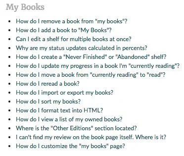
Our Help topics often use quotation marks to refer to elements in the UI. This is OK, but we may consider auditing our Help topics to follow this guideline. Imagine the screenshot below if all of the quoted text was bold instead. It would be much easier for members to find the topic they need.
Semicolons ( ; )
Semicolons are awesome; don't use them in UI text. If you have something complex to say, find a way to break it into shorter sentences.
Commas ( , )
Serial comma, series comma, or Oxford comma. (They're all the same thing.) We use them. When writing a series of items of a sentence, add a comma before the final conjunction:
"Red, yellow, and blue."
Formatting & Styling
Spaces
Insert only one space after a period. Putting two spaces between sentences is an old typewriter convention required for readability. Modern digital typesetting adds enough space between sentences using only one space.
Text Styles
Bold
Use bold when you need text to stand out on a page at a glance . Use sparingly for emphasis.
Italic
Use italicized text to add emphasis as the member reads .
Underline
Underlines should only be used as a hover state for hyperlinks. No exceptions.
Numbers
Use numerals. Never spell out numbers in UI language, despite other rules you might have followed in academic writing. Always use numerals. Numerals are easier for our members to scan and enhance usability.
Always use commas with your numerals. E.g: 72,031,626 books pledged
Format dates and timestamps
Making sure it’s clear when content was posted or action was taken is important to user experience. We add dates to our content so members can make decisions about its relevance.
Relative timestamps (1 day ago) are not as accurate as absolute timestamps (July 30, 2008), but they provide a sense of recency and avoid making the member do extra calculations to understand how old or new the content is. In general, we want to use relative timestamps when we think immediacy will be more important to our members than accuracy.
Below are the rules for timestamps that we implemented on the updates feed during the homepage overhaul. We opt for a relative timestamp for content under a month old, and an absolute timestamp for anything older than a month.
Just Now = under a minute ago
1m = 1 minute, for use in 1-59 minutes
1h = 1 hour, for use in 1-23 hours
1d = 1 day, for use in 1-6 days
1w = 1 week, for use in anything under a month
15 Mar = day and month, for use or anything older than a month
15 Mar 12 = anything in previous year
Terminology & Vocabulary
Consistency is key to reinforcing a brand—not just our own Goodreads brand, but our sub-brands as well as partner brands such as Kindle.
Vocabulary list
Among or amongst? Nonfiction or non-fiction? Updates or newsfeed? The editorial team has created a vocabulary list (you may need to request permission to view) that continues to grow as we add new products and services. Use these terms for consistency across Goodreads. (FYI: we use among, nonfiction, and updates)
There are a lot of language conventions that have yet to be standardized or decided upon. If you come across a situation like this, please add them to our “We need a rule” list at the bottom of this document.
Referencing members
Refer to users as Goodreads members
In any externally-facing text, call our users “Goodreads members.” Use this instead of users, customers, readers, Goodreaders, etc. This reinforces a sense of community and is easier to translate into other languages.
Pronouns
Goodreads members can set their preferred pronoun, so make sure to reference it when using a pronoun to refer to one. In cases where we don’t know the preferred gender pronoun, or if the members has chosen the neutral pronoun option in their account settings, it is OK to use the singular “they.”
Brand Terms
Brand terms are nouns or actions that are treated like proper nouns, even if they wouldn’t be normally. They are written in title case.
Brand terms include
The Goodreads brand
goodreads (only used in the logo), GoodReads, goodReads, Good Reads
Sub-brands and programs
Take the Challenge
Enter Giveaway
Titles or identities specific to Goodreads, like Librarian (technically an abbreviation of Goodreads Librarian)
Exception: “member” need not be capitalized
Goodreads-specific actions
‘Want to Read’
‘Currently Reading’
Editorial features and events
No: Goodreads Choice Awards: the best books 2016
Yes: Goodreads Choice Awards: The Best Books 2016
Goodreads Choice Awards: Decide the Best Books of the Year
‘Decide’ is capitalized because it’s the first word after a colon. All other words are part of brand terms.
Genres
Science Fiction, not Science-fiction
Humor and Comedy, not Humor And Comedy (conjunctions are not capitalized in title case unless they are the first word in the term)
Young Adult, not Young adult
Don’t translate brand terms.
The Goodreads brand and brand terms are never translated. We treat sub-brands and programs the same way we treat Goodreads and do not translate them. This is a decision that can be revisited when we decide to focus more on non-English-speaking markets. But, for now, anywhere we refer to a sub-brand on a surface that is translated (ereader and Fire, for example) we display that string in English.
When naming a new feature, avoid coining new terms or creating feature names when a description would suffice. This will also help when translating our content to other languages.
Don’t abbreviate brand terms
Never abbreviate our brand terms to an external audience. GR, KNH, GCA, RC, etc. are OK to use internally, but even internally abbreviations can be confusing.
Kindle’s marketing text guidelines
The Kindle organization has guidelines about how to talk with customers about Kindle apps and devices. We should honor their standards as much as possible, especially in any product marketing language.
Process
Think about UI language early
“Content precedes design. Design in the absence of content is not design, it’s decoration.”
–Jeffrey Zeldman
We think about UI language early in the design process. This gives us time to involve stakeholders and iterate on text and to fix design problems that the text might reveal.
Engage stakeholders at the right time
We speak to our members in a lot of different contexts. This guide focuses on UI language, but the lines between UI, marketing, and editorial content can sometimes be blurry. Below are different types of written content on Goodreads and the different stakeholders you should engage depending on your project’s needs.
Banish lorem ipsum
We use real text—not lorem ipsum—in mockups. Content should be considered throughout the design process along with the interaction and visual design. The words shouldn’t be poured into the design right before launch. Instead, the experience should be built around the narrative.
Our mantra during the design process is that the fidelity of the design should match the fidelity of thinking. Therefore, it is ok to have draft copy in place for early mockups that gets refined alongside the UI. If you have no idea what the language in your designs needs to convey, then you likely need to go back to defining the user flow and figuring out the overall narrative—you are not ready to make mockups yet.
That being said, remember not to use private members data in your mocks.
Resources
4Syllables - Accessibility evaluation for web writers
ADA.gov - Rules on the accessibility of web content and apps provided by state and local governments
WebAIM - Designing for Screen Reader Compatibility
Color Safe - Accessible color combinations
WAVE - Web Accessibility Evaluation Tool