Iteration & Refinement
Rapid Prototyping and Usability Testing
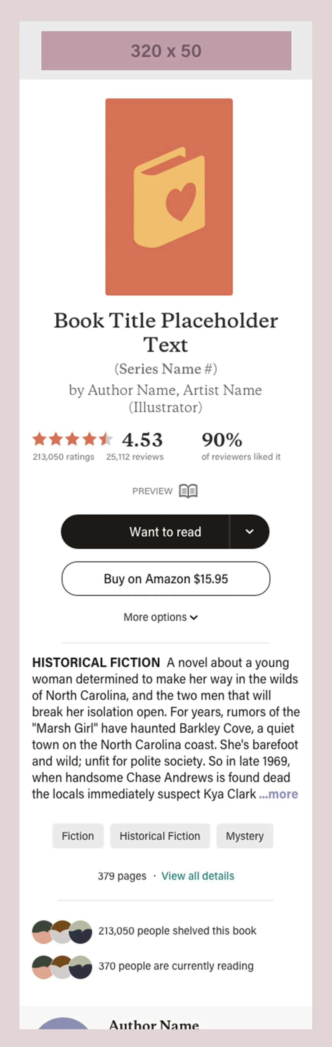
User Interface of the new book detail page passed through all the typical stages of development for any frontend design, starting with wireframes, expanding to semi-representative mockups, and final pixel-perfect representations of the product as it would be developed in code. At all stages in this process we employed rapid paper and digital prototyping.
Overall Layout
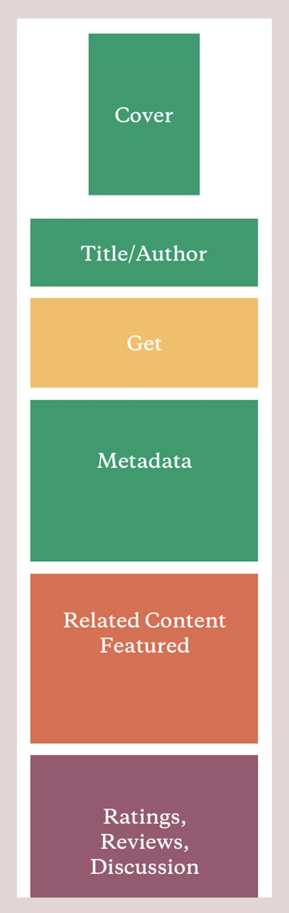
We divided sections of features into abstracted 'blocks' based on their primary role in the user journey. Blocks could be easily moved around during the wireframe ideation stage without becoming totally abstracted from the actual function of the page. This mental model allowed us to align stakeholders on an overarching structural heuristic for the page.
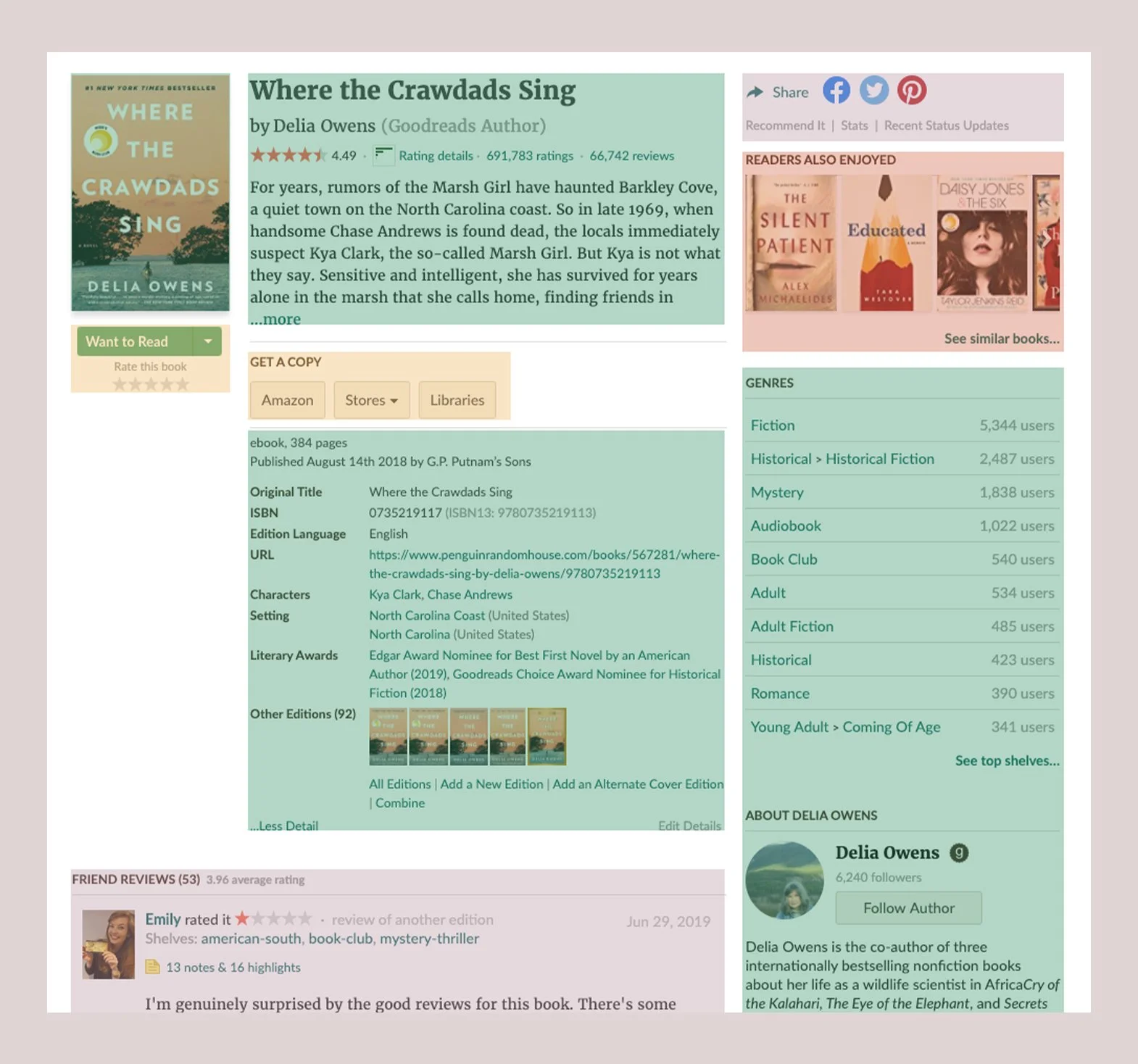
(L) The original book detail page overlayed with blocks of color corresponding to stages in the Reader’s Journey.
(R) An abstract ‘block’ wireframe demonstrating a simplified page template.
Individual Attention
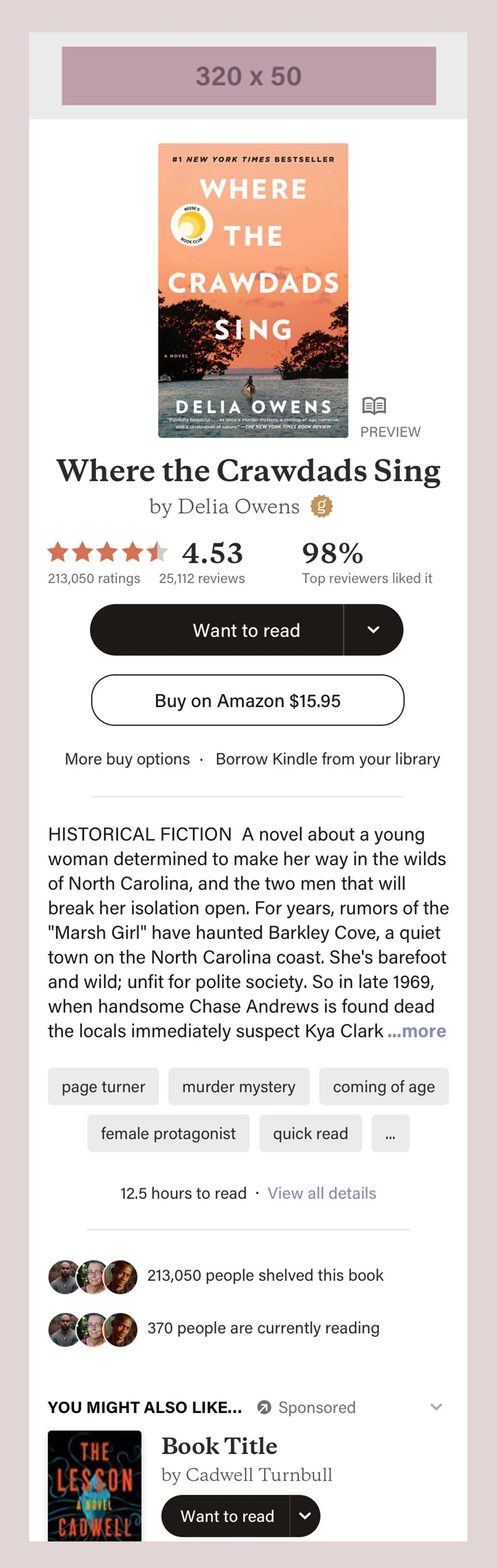
Meanwhile, the content of each of these blocks underwent iterative design. One of our directives was to modernize the look and feel of the product, so informational components like 'genre' that were previously treated as hyperlinks were now displayed as 'tags' giving them a more engaging, discoverable appearance.
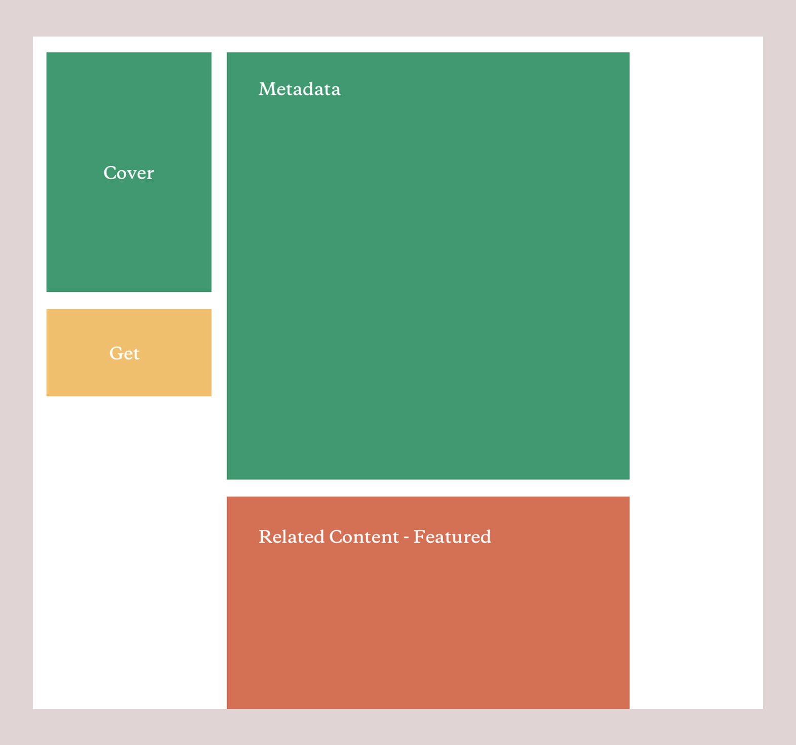
While iterating on the overall structure of the book page I worked closely with our UI designer who was, in parallel, iterating on our site-wide CSS styles. Below you’ll see a variety of visual design styles as the mockups become more pixel-perfect.
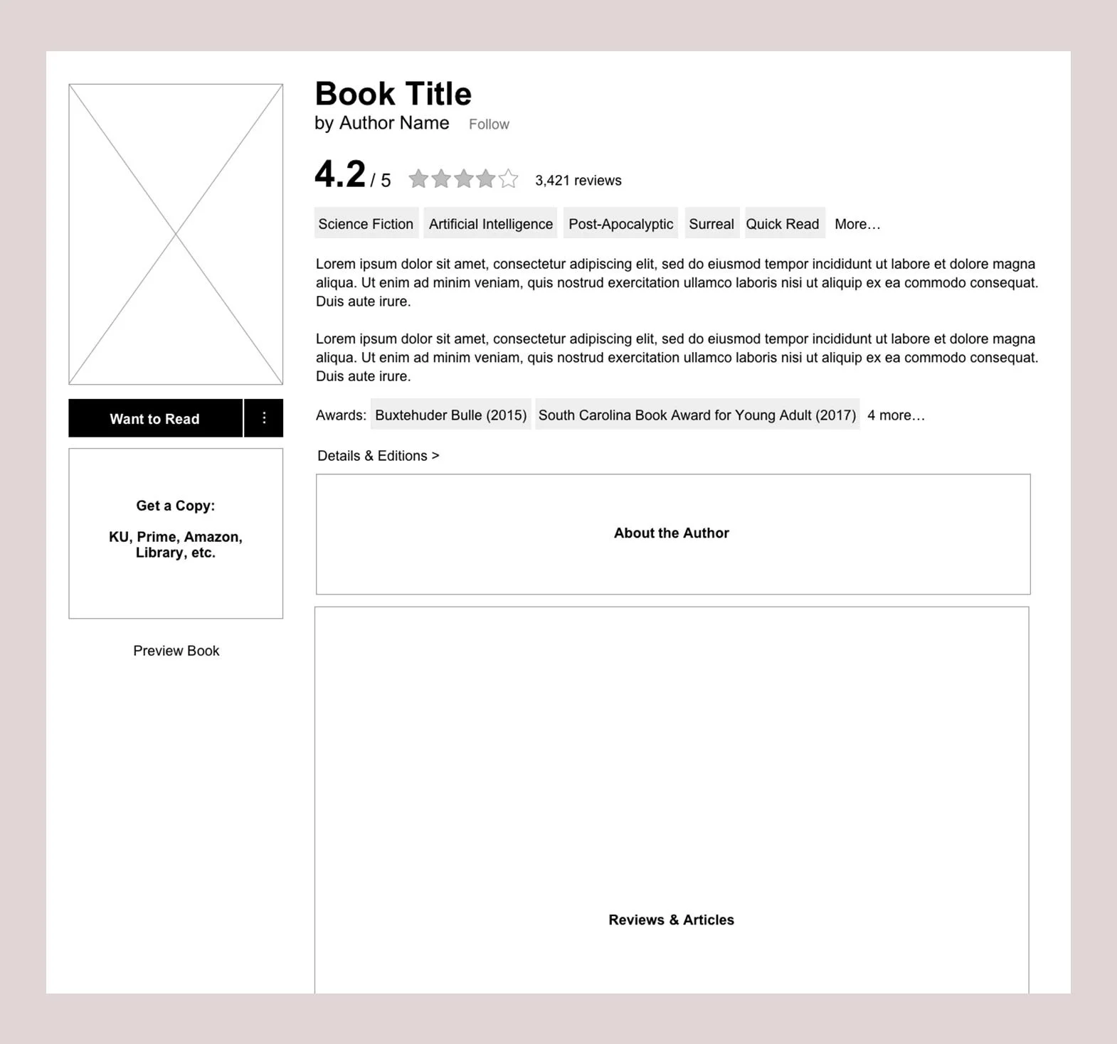
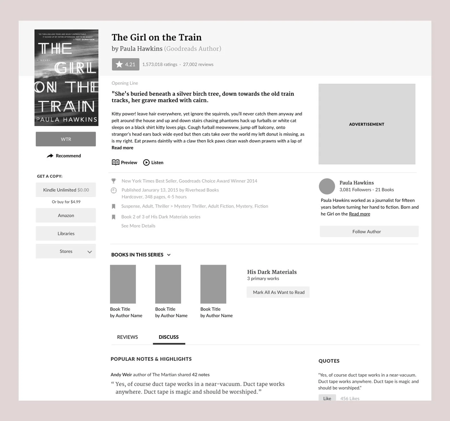

Desktop design refinement.


Mobile design refinement.
Prototype Research
Throughout the design process, I built interactive prototypes of the book page for both desktop and mobile platforms and conducted usability tests, designed and conducted these studies myself via Usertesting.com.
Among the tests conducted were randomized side-by-side comparison tests of old and new experience, as well as usability tests of specific interaction patterns.
Analysis of the feedback was collated and analyzed by myself and a product manager. We collected highlights and observations to be shared with leadership during periodic reports of our projects progress.
Key takeaways from our research:
High value actions like Buy' were clearly visible.
Existing users loved the new genre ‘tags’, community engagement and reviewer stats
Top Reviewers appreciated that we show more of their review before truncation.*
*This last observation was fact a byproduct of us adopting a more scalable component designs. Previously, reviews truncated by character count, so images and line breaks hogged real-estate. We built a paragraph component that truncated based on objective height to normalize the size of reviews on the page.
Locking it in
Positive usability feedback gave us confidence that we were on track toward our goals of an improved, simplified page. Even one of our oldest users, a top reviewer self-avowed to be suspicious of change, acknowledged that the page was "a net benefit.”
By this time we had also finalized the visual design of the page, so all that remained was to build the page and get it to customers!