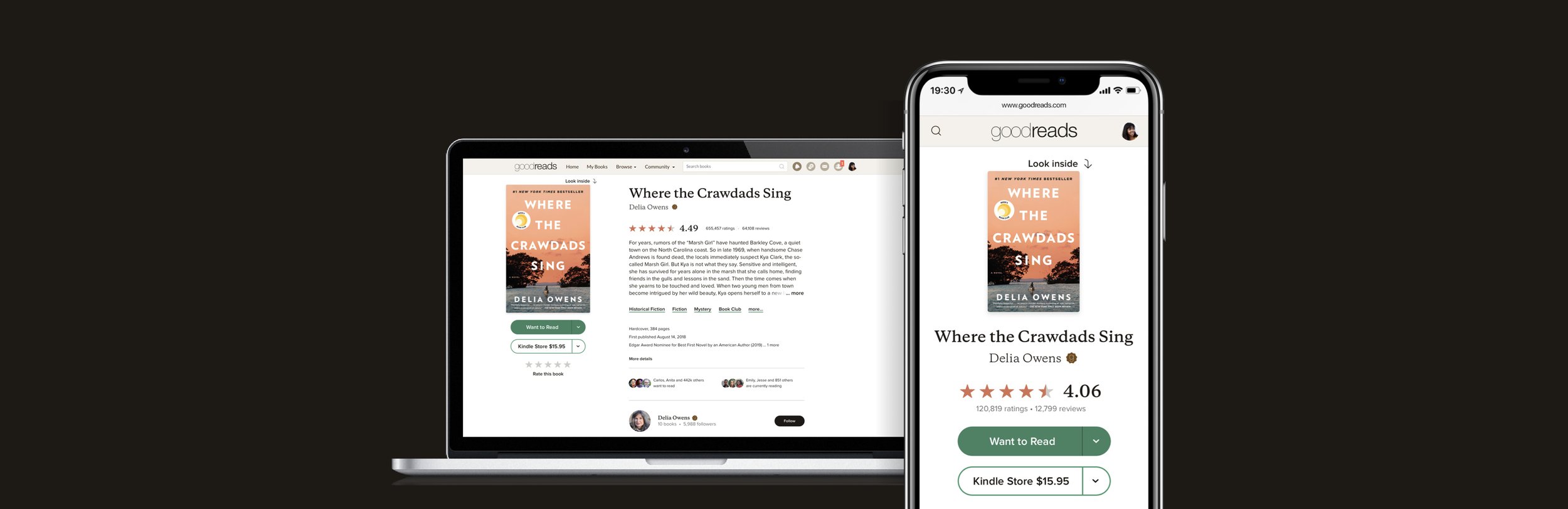
Goodreads Book Detail Page
Reinventing Goodreads’ Most Important Page
Responsive Design Systems • Growth Strategy • Foundational Research • Iterative Design
Overview
In 2020, Goodreads began a large-scale upgrade of its front-end framework, moving to isomorphic Javascript apps powered by AWS AppSync.
The Design team had a broad directive to transform the CX of the website, starting with our most high-value page: the Book Detail Page.
The Book Detail page accounts for the plurality of both signed-in and signed-out views across Goodreads.com. Its performance and usability is fundamental to Goodreads as a service, and a business.
The page’s design had not been significantly altered in over 10 years.
Project Goals
Redesign the highest-trafficked page on Goodreads with responsive web conventions and an improved user experience.
Simplify the feature set of the page to the most important user needs — learning about the book and reading reviews from Goodreads members.
Drive engagement actions, user acquisition and other high value actions.
Maintain advertising revenue streams.
Engagement actions are a set of tracked behaviors that correlate with increased use of the website and usefulness of the site to the customer. For this project they include 'shelving' or rating a book, logging in/signing up, and clicking the 'buy/get' button.
My Role & Responsibilities
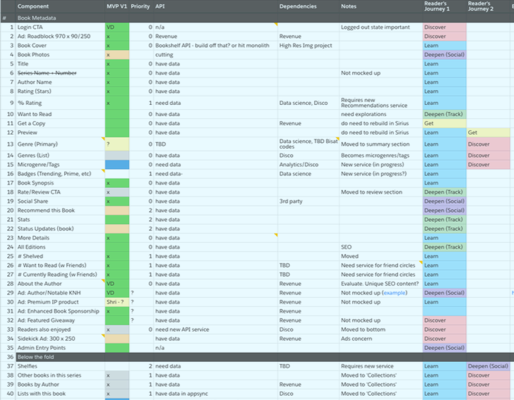
Define the key features of the launch product, collaborating side by side with stakeholders on the leadership, data science, revenue & design teams.
Compile, plan and conduct user research exploring existing and proposed design solutions.
Collaborate directly with engineering team members to drive an aggressive launch timeline.
Timeline
Q4 2019 - Q3 2021
Key Innovations
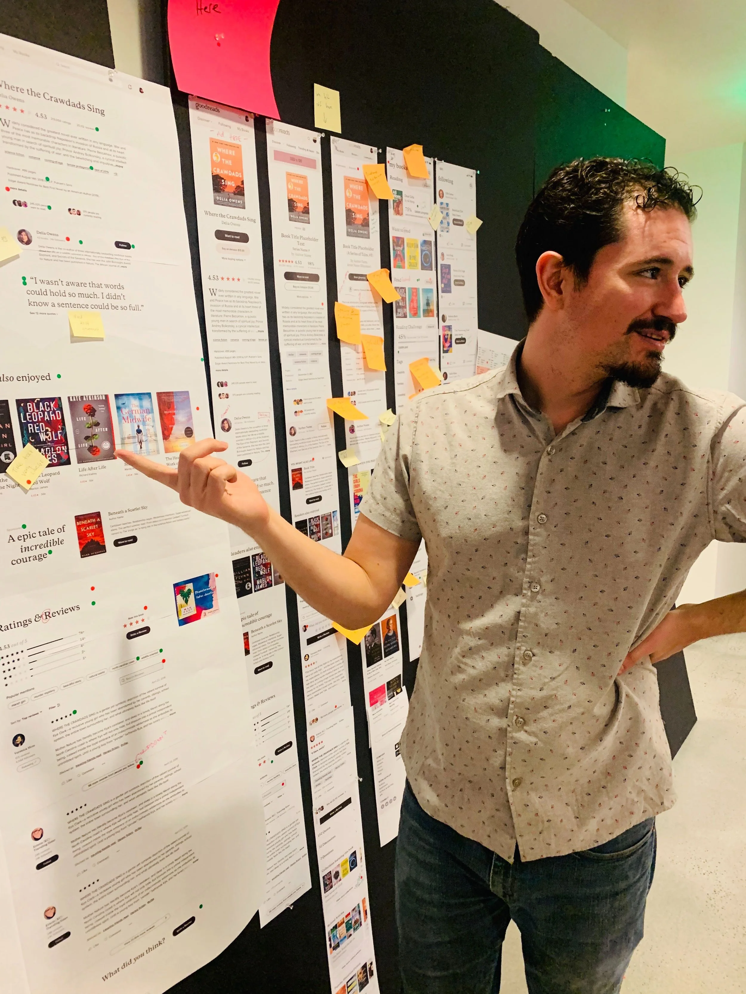
The new Book Detail Page launched with a host of improvements and optimizations, but here I will narrow in on the main drivers of its success.
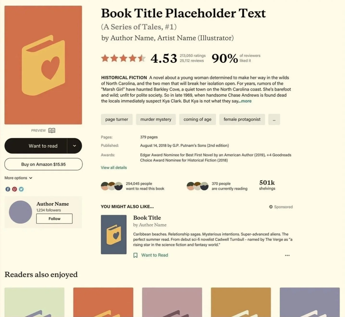
Renewed focus on action
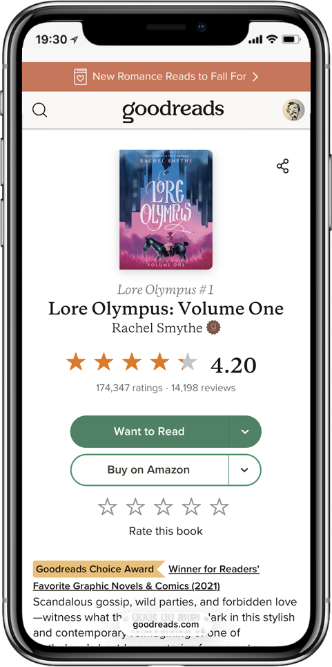
To ensure that visitors to Goodreads had no friction should they want to take action on the book they're evaluating, it was crucial that we consolidate and group actions related to the the book together on the page.
Previously the Want to Read/Rate the Book actions were on totally different parts of the page. Now they were stacked beneath the book cover. This new design also ensured that the buttons would always load 'above the fold' on most desktop and mobile platforms.
A new feature that was both delightful to customers and strategically crucial was to add a float tag to the book cover and action buttons on desktop platforms. Previously, if a reader browsed deep into the page they'd need to scroll back up to see the cover or shelve the book. Now, that information travels with them.
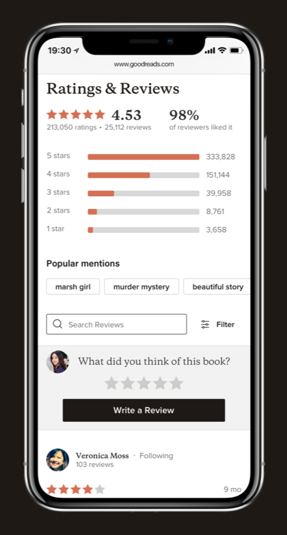
Clarity at a Glance
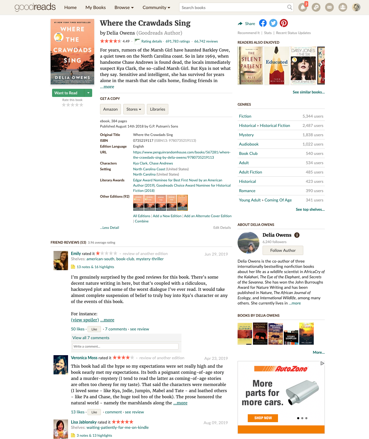
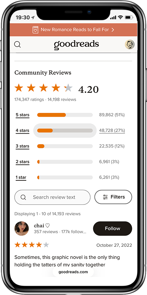
The most complex aspect of the book detail page was the Ratings & Reviews segment. Based on user research, we identified that the most important user requirement was to "“quickly assess overall sentiment for a particular book.”
To facilitate that, I introduced the interactive review distribution graph. This presents an immediate visual cue that can provide insights not apparent from the rating average, and the interactive graphic elements encourage visitors to try out the many filters available for drilling down into specific insights.
Another repeated user story we observed in usability studies was that customers were more interested in reviews from readers they trusted. Anyone can write a review, but some people's opinions are (subjectively) worth more than others.
To address this implicit need, we added key stats and actions to the reviewer display corresponding to each review. Previously, if you wanted to know how active a given reviewer was, you'd have to click through to their user profile. If you appreciated a reviewer and wanted to follow them, same deal. The new design elevated that information and reduced friction to "Follow" top reviewers (another key engagement action).
Results
The book detail page was launched in a phased A/B test release starting in Q2 2021.
Overall page conversions (which included shelving actions, buy buttons, and sign-in/sign-up) increased by approximately 20% across all platforms.
The new design was progressively rolled out, reaching all logged in and logged out customers by 2022. Since then, the frontend components built for the book detail page template have been used to update other pages across the website at a significantly reduced engineering cost, thanks to our investment in a flexible component library and design system.
Takeaways
My biggest personal learning was an appreciation for the work required to maintain a large, legacy product. Technology is constantly evolving, and software services frequently find themselves running just to stay in the same place.
Hindsight is 20/20, but in reviewing the legacy page, I lost count of the times I found inefficiencies that could have been avoided had the product originally been built with a strong design system at its foundation.
While it was a tremendous effort to rebuild such an important page, I am confident that the design system and modular component philosophy we applied to this project will make future iterative improvements of the page much less burdensome.
What drove the improvement?
Prior to launch, comparative usability testing indicated engagement actions were more visible on the new page, and hypothesized that customers would take these actions more frequently. A limited opt-in beta supported our theory, and post-launch usage analytics further confirmed the improvement.
One possible confound to our conclusion is that performance of the new page significantly improved. Thanks to the new React.js framework and a progressive loading protocol, server-side p90 latency was reduced by 6 seconds.
Here are some of my favorite book (pages)!