Information Design
Analytics Tools at Yahoo

While at Yahoo Mobile I got to work on an internal analytics tool called ‘Snoopy.’ The goal of it was essentially to implement the kind of analytics charts you get from software like Tableau (and indeed, my explicit directive was to model my designs off that service.)
I won’t pretend that the final product looked as clean as my mockups do here. This was still early in my design career when I naively thought that it made economic sense to build custom CSS styles for all the buttons in an internal tool. However, the core of my designs—the information architecture, progressive filter disclosure, and key views like the retention grid and funnel tools, were successfully implemented. I share the mockups here because I do not have permission to share screenshots of an internal product displaying confidential data. And frankly, while perfectly functional, the finished product was ugly as sin.
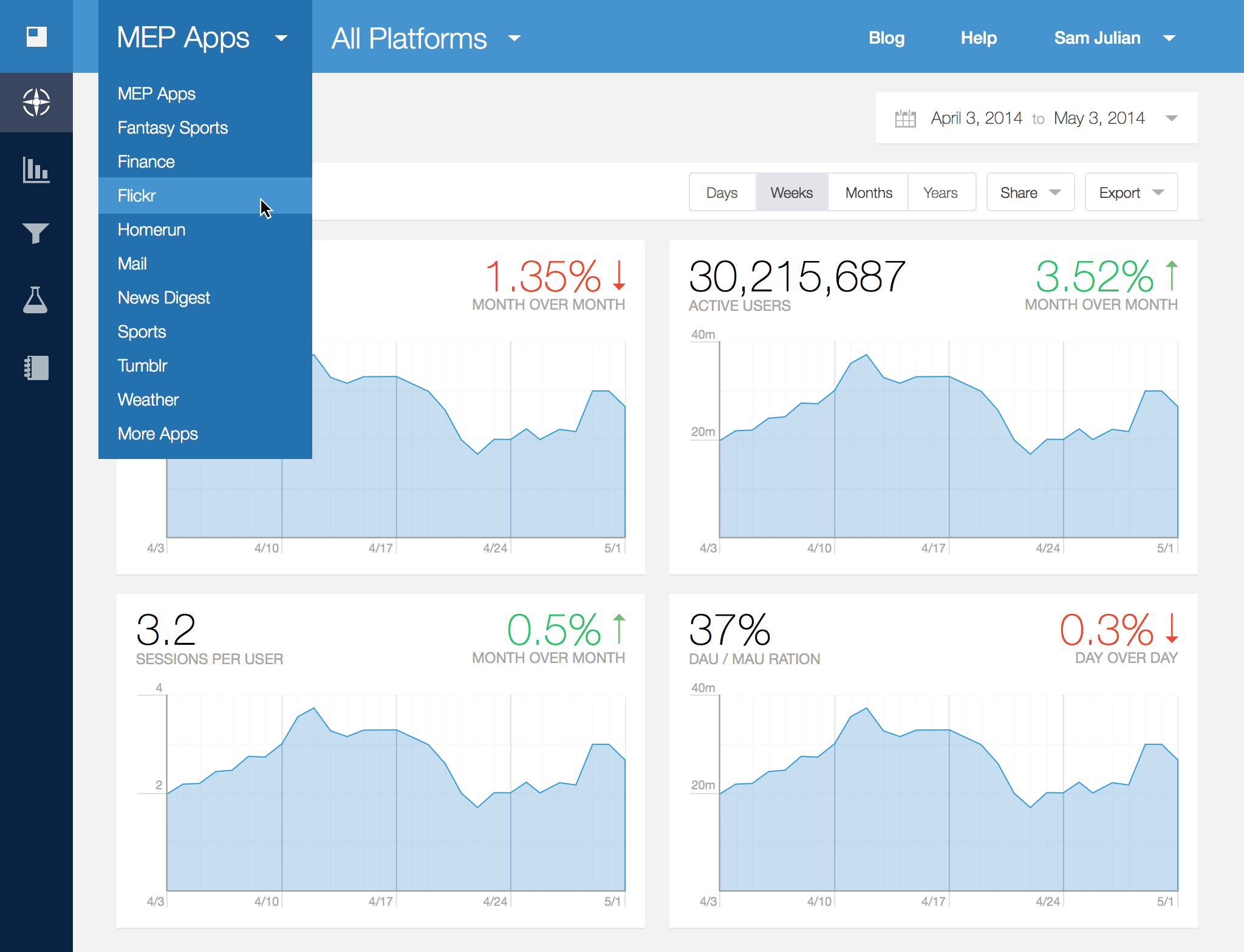
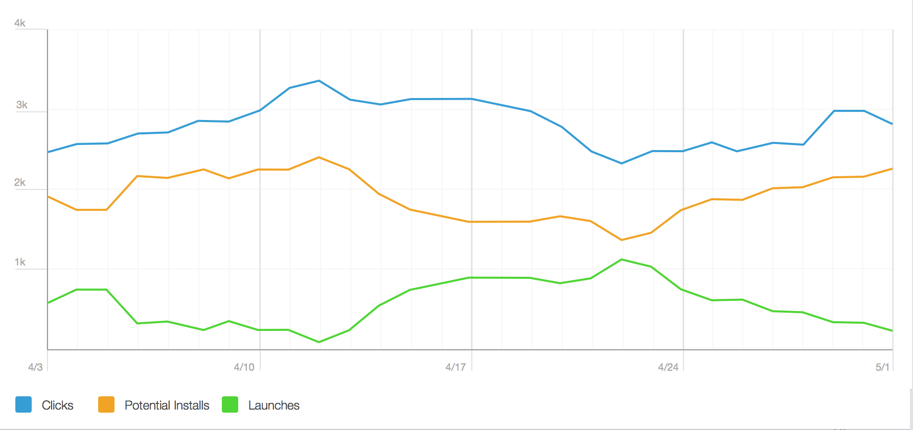
This was the main dashboard view, along with a glimpse of the navigation architecture. Each app team was able to customize their top-level table displays. Within each app, data could be filtered by platform.
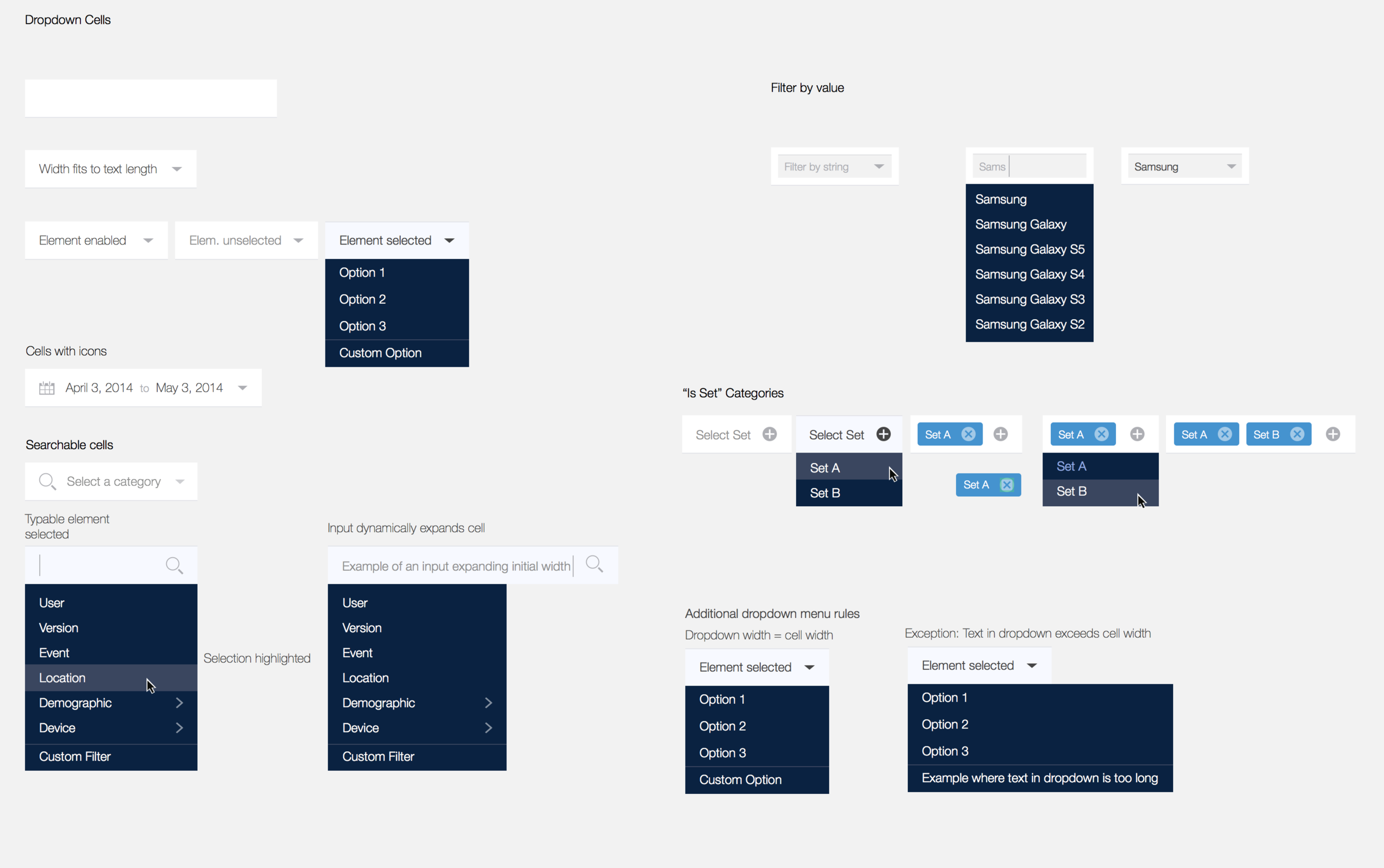
A known limitation of this dropdown navigation filter design was that while you could view consolidated data for all apps at once (MEP Apps), you could not view data for a custom subset of apps.
The most important feature of this product was the humble ‘Export’ button. Once a product manager had pulled up the particular view they wanted to share, it was important that they be able to download it in a variety of formats.

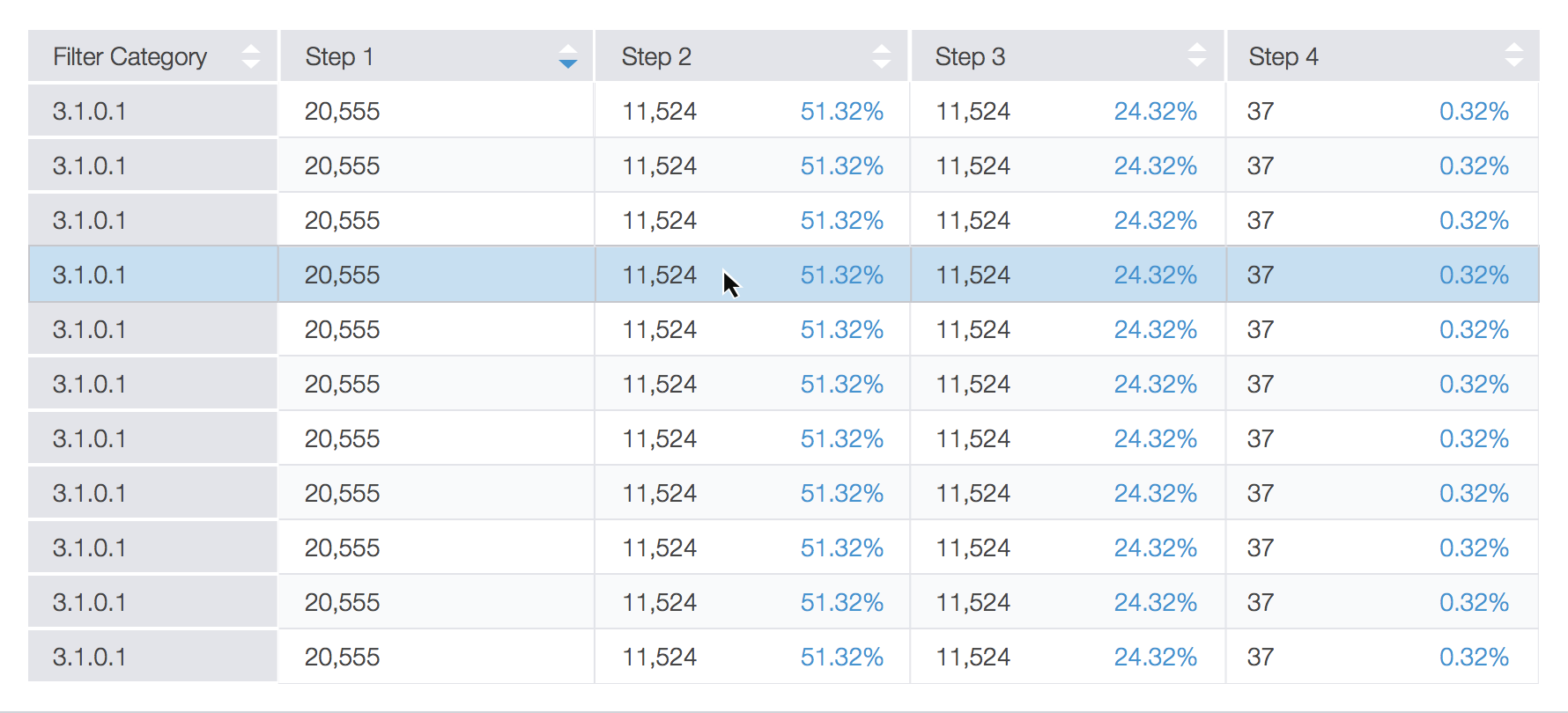
Behavior funnels was a complex interface to design and document. Users were particularly pleased with the ability to quickly rearrange the order of the actions being funneled.

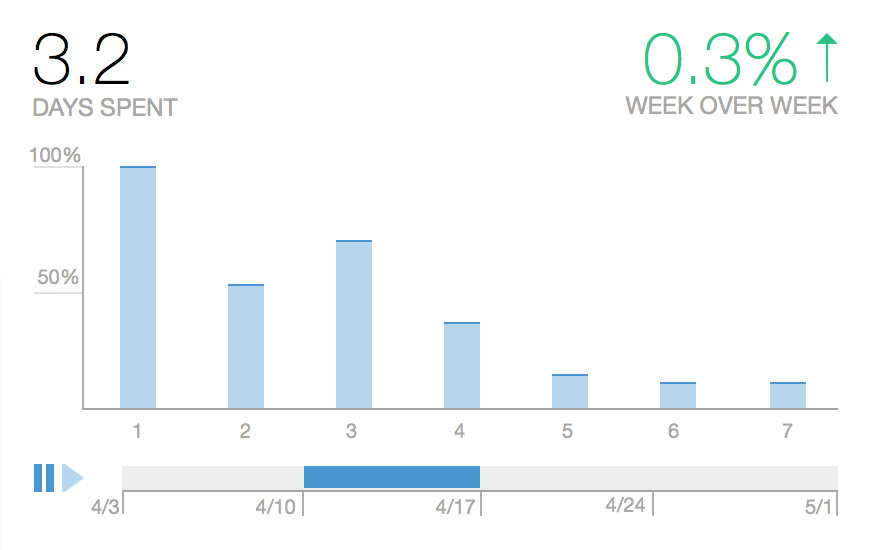
Retention over time for a particular user segment, a key view for product and business leads.