Goodreads Design System
Strong foundations built from the right tools
Systems Design • Process Documentation • Process Formalization • Team Education
Overview
In 2019, Goodreads began the adoption of a new React.js frontend framework to improve site performance and support responsive form factors. Engineering partnered with the design team to ensure that the UI framework they built was organized efficiently and conformed to modern design and accessibility standards. The resulting working group and the style guide it produced was called ‘Folio.’
Goal
Accelerate design and development through the adoption of an extensible web design system.
Deliverables
A shared component toolkit for designers and developers.
A central repository for style guidelines and component reference.
A formalized review process for new components.
Roles & Responsibilities
As lead designer of the Goodreads design system, it was my responsibility to:
Lead a cross-functional working group to identify and prioritize system component needs.
Align with the Design team on a shared process for design review and adoption of component elements into the design system.
Produce component toolkit artifacts on Figma,
Collaborate with the working group to clarify guidelines for use, and production specifications.
Working Group
Lead Designer (Myself)
Design collaborators (3)
Engineering Collaborators (3)
Product Manager
Timeline
Initial development Q2 2019 - Q4 2019
Principles
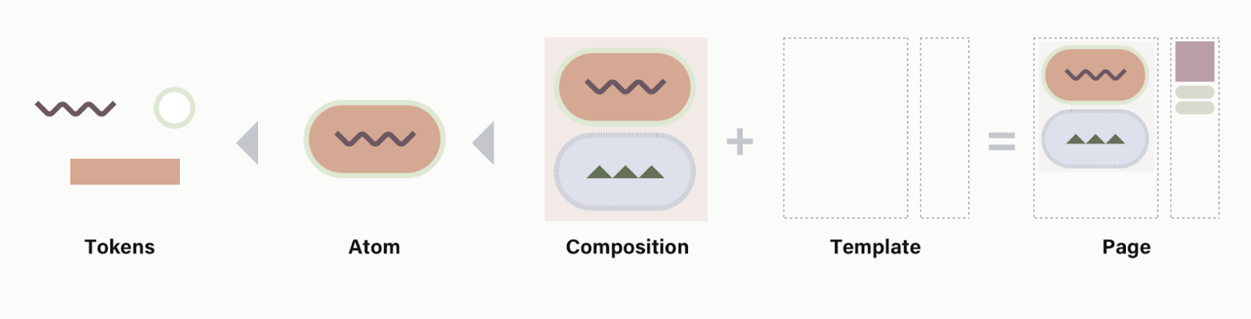
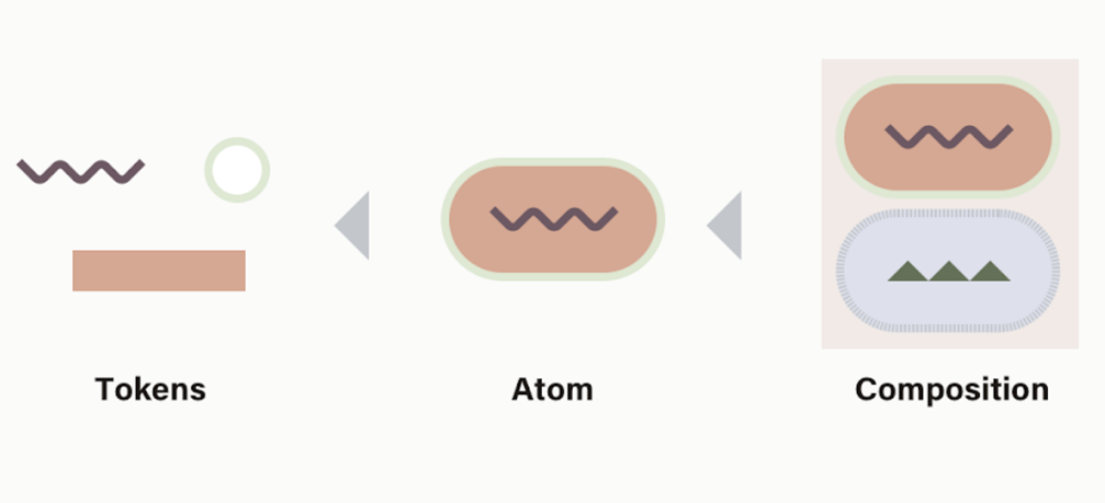
Atomic Components
Our organizing principles were based around Atomic Design methodology, which aims to organize component design from the bottom-up, maximizing reusability and reducing future frontend development costs.
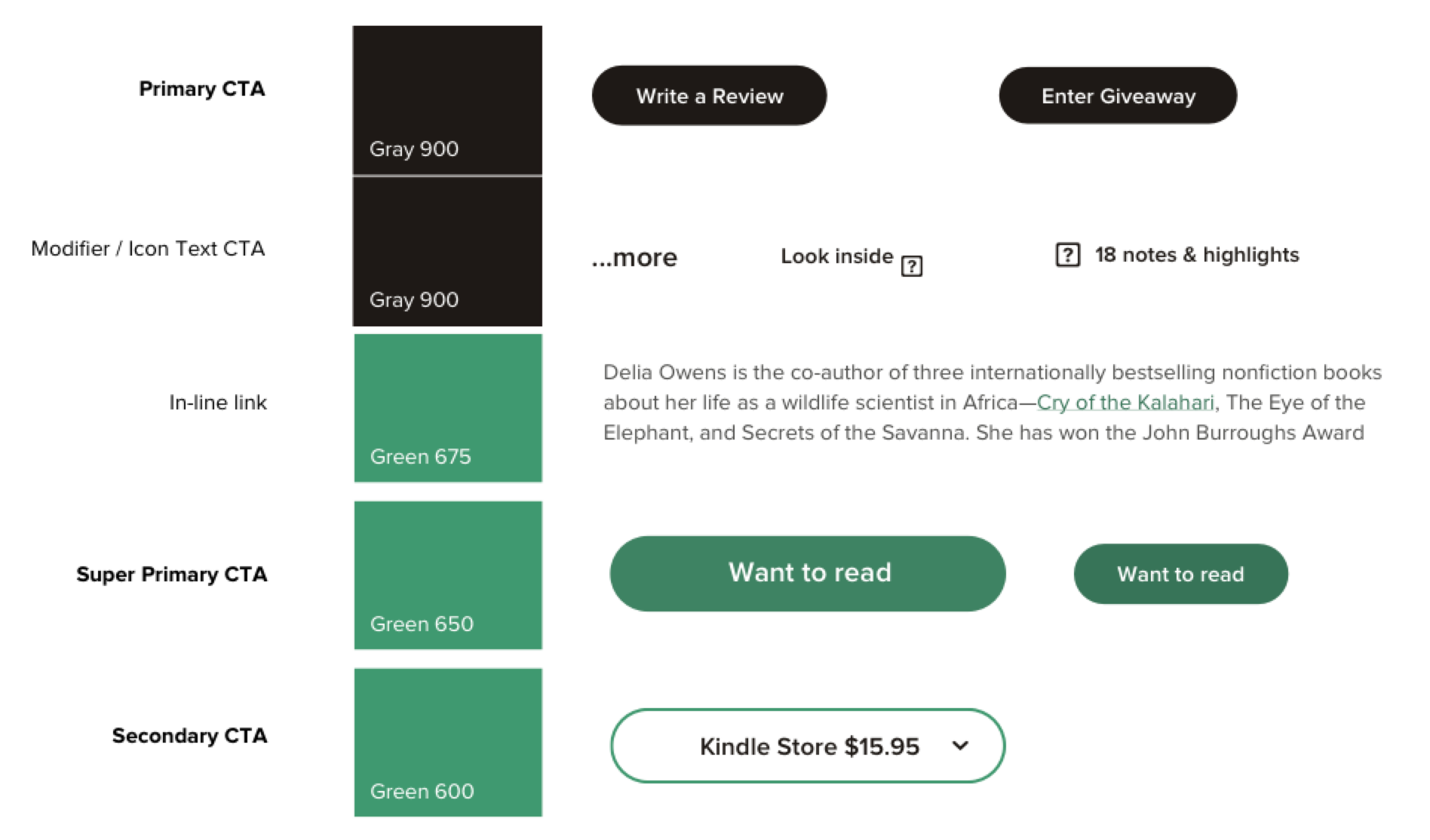
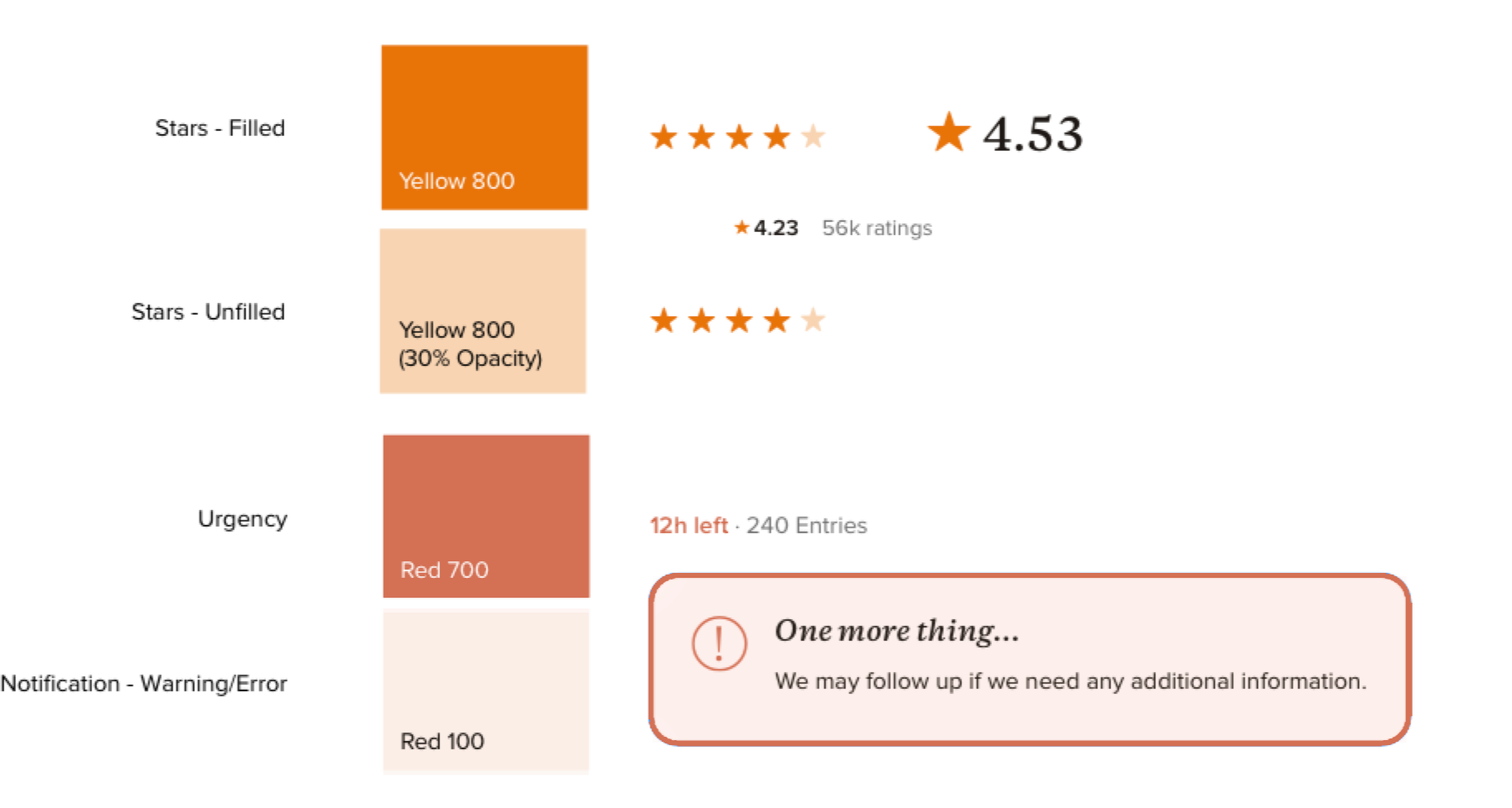
100% Semantic Tokenization
A key enforcement method to achieve this was to adopt semantic tokens for color, spacing and other numerical variables.
This allows for rapid adjustment of CSS styles and theming, a relevant feature for time-bound events like the annual Goodreads Choice Awards.
Built-in Responsive Breakpoints
All pages in the new Folio framework were built on preset templates that shared structural elements like columns and ad slots, and 3-4 responsive breakpoints.
Each breakpoint specified minimum and maximum widths for the various containers, and allowed persistent components to be shifted as needed to facilitate usability.
Extensible Component Groups
Common information patterns used across the site were standardized with the adoption of ‘Compositions’, essentially groups of components bundled together with variable display options.
The book preview component shown here is a specific variant of a generic ‘object container’ composition. All analogous ‘book preview components’ are variants of this component, following a consistent hierarchy of information display, ensuring flexibility to display contextually important metadata in a consistent location relative to the object image.
The Book Preview Composition’s ‘Recipe’
Below are example applications of the Book Preview Composition in different contexts.
Tools & Processes
Component Library & Design Guide
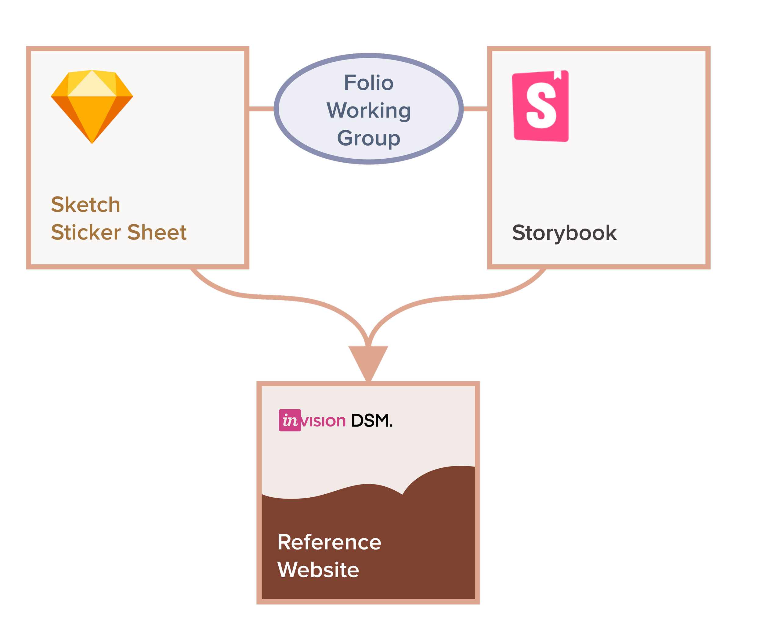
At the start of this project, our team used a combination of tools to create our reference website. Design components were maintained in a shared ‘Sticker Sheet’ component library. The engineering team used Storybook to document built components, and Invision DSM consolidated both resources into a shared reference website with written usage guidelines.
Over the course of the project the Goodreads Design team adopted Figma, and we were able to combine our component library and reference documentation on a single shareable webpage.
Design Review Process
Folio was designed to be a system adopted by all engineering teams at Goodreads, and so the practical process for how components would be reviewed and added to the system was just as important as the components themselves.
I worked with a product manager partner to develop a design review workflow that would ensure any new components followed established standards and leveraged existing components and tokens as much as possible.
UI Language Style Guide
Word choice and usage is important in any context, but at Goodreads especially standards are high. As a side project, I expanded and formalized and existing Goodreads UI Language Style Guide to be shared alongside the Folio Design System. An abbreviated version of the guide with proprietary information removed can be read here.
Results
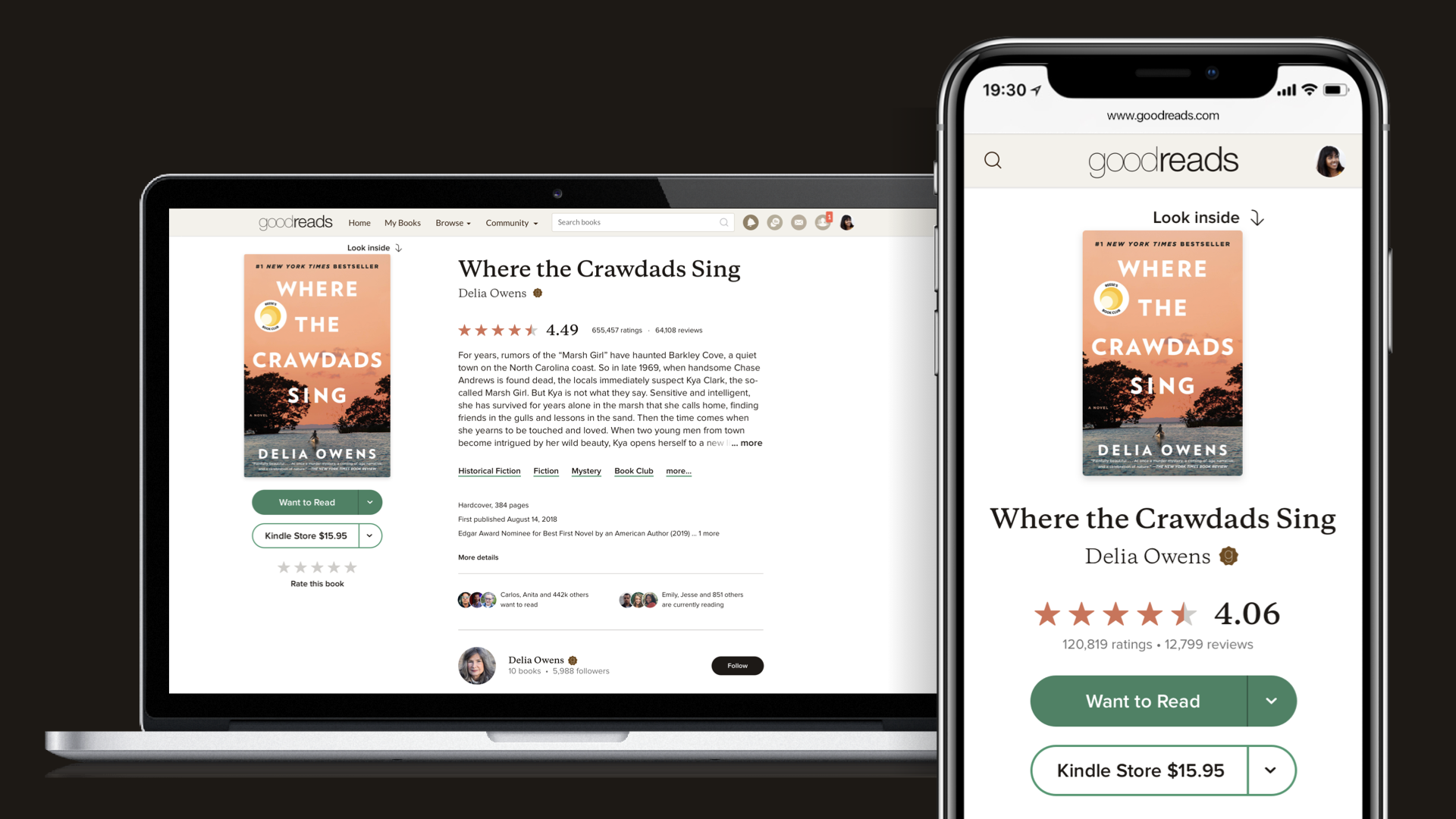
The the flagship page launched with the new design system was the Goodreads Book Detail Page, a multi-year project I led in parallel with the Folio working group.
Even before that feature was released, the Advertising team was able to use Folio to build a new page for their Giveaways product. Soon after, the ‘Discovery’ team used Folio to build the new Explore page.
Internal feedback was overwhelmingly positive. The design system allowed for much faster frontend development, responsive support was built in by default, and the UI upgrade gave Goodreads a much more modern look.